Inky Goodness

Welcome! Thanks for stopping by and indulging my random thoughts on crafting and all things inky and messy. Nothing makes me happier than inky fingers and paint under my fingernails at the end of the day. A little glitter never hurts either. ;) Happy crafting!

Wednesday, September 29, 2010

September Arsty Addicts Layout Challenge: Handmade

I just adore the monthly Artsy Addict's (Marion Smith's online group) challenges!  This month's was to create a layout from items you made/modified yourself including the background page.  Right up my alley!!!  I like to tie my photos into the theme for these challenges (I know it's corny) so I knew right away I wanted to use this one picture of our cat Mikey that shows off the classic feline silhouette to play up the "art" theme.  He truly is a work of art!

Leonardo Da Vinci was right: The Smallest Feline is a Masterpiece

My usual creative process usually goes like this:
  1. Select a photo(s)
  2. Choose a color scheme
  3. Pick a background
  4. Add a title
  5. Add embellishments
Since everything was to be made from scratch all I really needed to decide beforehand is what color scheme I wanted to use.  I have been loving the heavy body acrylics lately and there is a shade of purple (Prism Violet by Liquitex) that I adore.  I also have Glimmer Glam in a fabulous shade of teal called Mermaid.  Purple and teal - sounded like a great color scheme to me!

I prefer to use canvas or a canvas pad for acrylics when I paint, especially with heavy body acrylics.  Watercolor paper and cardstock don't seem to hold up as well and they curl quite a bit.  I also really like the texture of canvas and it lends itself to dry brushing as you've seen in some of my other posts.

Acrylics on canvas paper with a dry brushed coat of Glimmer Glam

I used 2 shades of purple and a red to create the background thinning the paint with a bit of water as needed. I added some white in the center to help lighten it and begin to create a focal point.  I like to keep my edges darker.  To help blend the colors together, I prefer to use my favorite tool:

Painty goodness
Once the background was completely dry, I used a fan brush on the Mermaid Glimmer Glam to lightly brush across the surface.  I started at the edges first and pulled the paint into the center so most of the color remained on the edges.  Glam is pretty sheer so what I ended up with in the center was mostly the chunks of glitter which gave a nice texture.  Layer 1 was complete!

For layer 2, I added a floral vine stamp around the edges and a text stamp using black ink.  I then did another layer of glam over the top once the ink was dry.  For the photo frame, I painted fiber paste onto the background with, you guessed it, my finger.  I love the texture of the fiber paste!  Once the paste was dry I applied some silver glimmer mist with a paint brush.  Once that dried, I lightly went over it with a black marker letting the marker skip a bit over the texture.  I then added a bit of Glimmer Glaze in a teal shade to give it some color.  I mounted my photo with dimensional adhesive dots to help it stand out from the background.
Fiber paste photo frame, aluminum and H2O color paper title
Ever cut open a Coors Light can?  They are a lovely shade of pale teal inside.  I love to die cut and emboss it.  Hubby is always a good sport and makes sure the cans are empty (his favorite part) and clean and he cuts them open for me.  After die cutting and embossing the letters, I rubbed them with a bit of black permanent ink.  Once adhered to the page I lightly drew around them with a maker to help them stand out and look more "artsy".  For the word "Art" I decided to channel Julie Balzer and hand cut the word!  First I wrote it with a yellow H2O soluble oil pastel and used water to blend out the color.  I then stamped over it with the same text stamp used on the background and then wrote over it with a black marker.  I added some silver ink dots as well.  I wrote and then cut out the Leonardo quote from H2O color paper and then used a yellow water color pencil to add color and stamped the words with the text stamp to add texture.

For the flowers I die cut crinoline and painted them with various shades of Glimmer Mist.  I love using crinoline for these types of flowers!  Crinoline is the stiff fabric often used in slips under hoops skirts.  It's flexible but stiff enough to hold it's shape nicely and it takes color very well. 


Painted flowers waiting to dry. 
 I cut five layers for each flower and folded 4 of the layers into quarters to assemble them into dimensional flowers (see earlier blog post).  I added some Glimmer Glam to the edges to help give them added sparkle.  A jewel in the center and some ribbon vine for stems and the flowers were done!

Crinoline flowers.  You can also see the texture from the fiber paste photo frame and the chunks of glitter from the Glimmer Glam on the background in this shot.

For the finishing touch I added another crinoline flower and chipboard flourishes to the corner of the photo.  I stamped and used a black marker on the flourishes and then painted them with silver ink and teal Glimmer Glaze.  Glaze is more dimensional and opaque than Glam.  It's also shimmery and does not have the chunks of glitter that Glam does.  I love to use all of these coloring media together.  More painty goodness.  :)

Glam vs Glaze.  The teal and chunks of glitter on the background are from the Glam and the teal on the photo frame and flourishes are from the Glaze.
All in all it was a fun challenge and I feel totally back to my stamping roots again - yay!  Thanks for stopping by!

Supplies used:
  • Purple Prism and Alizarin Crimson heavy body acrylics (Liquitex)
  • Titanium white heavy body acrylic (Golden)
  • Purple studio paint (Claudine Hellmuth for Ranger)
  • Mermaid, Luscious Lavender, Chandelier, and Lipstick Pink Glimmer Glam (Tattered Angels)
  • Waterfall Glimmer Glaze (Tattered Angels)
  • Banana Pudding, Cotton Candy and Peacock Chalkboard Glimmer Mist (Tattered Angels)
  • Silver Sugar, Cherry Limeade, Spring Violet, Key Lime Pie and Purple Pansy Glimmer Mist (Tattered Angels)
  • Clear stamps (Heidi Swapp for Tattered Angels)
  • Teal jewels (Creative Imaginations)
  • Vine ribbon (May Arts)
  • Black permanent ink (StazOn)
  • Black Slick Writer Marker (American Crafts)
  • Chipboard flourishes (Maya Road)
  • Fiber paste (Golden)
  • Water soluble oil pastels (CretaColor Aqua stic)
  • Water color pencils (Karat Aquarell Steadtler)
  • Tim Holtz Grunge Flower die (Sizzix)
  • Olivia font die (Cuttlebug)
  • Crinoline fabric
  • Water color paper (Strathmore)
  • Canvas paper for acrylics (Canson)
  • Glossy and Matte Accents (Ranger)
  • Fabritac (Beacon)
  • Zap dots (Helmar)

Monday, September 27, 2010

A Quick and Lazy Challenge

My oh my has September been busy!  I've been traveling for work for the last couple of weeks and am just now getting settled back home and in the crafty swing of things.  I'm so behind on my Prima and Marion Smith Ustream shows not to mention all of my fab YouTube friends!

Even though I visited some great scrapbooking and art stores in Chicago (Windy City Scrapbooking) and in southern Oregon (ScrappyCraft and Craft Warehouse), all of which I recommend especially ScrappyCraft,  I came home feeling a bit worn out and in a creative slump.  I had two major projects to complete before the end of the month:
  1. September's Artsy Addicts challenge: create a layout using paper and embellishments you create yourself - totally up my alley!
  2. Create an anniversary present for my hubby for our 1 year wedding anniversary.  Paper is the traditional gift for year one - again, totally up my alley!
But when I got back from OR, I just couldn't seem to get it together.  I had a lot of ideas but wasn't feeling like putting them to "paper".  That is, until my amazing husband gave us BOTH a challenge.  This is one of the many reasons he is the perfect hubby for me.

I was whining about how I had to get moving on my projects and just wasn't "feeling it".  He came over and said, "why don't we both go into the garage (where his painting studio is) and grab one sheet of canvas and some acrylics and just paint?  I'll do one side and you do the other. Come on, it'll be fun!"  Brilliant!  The idea was to use whatever was in the paint drawer and nothing else.  No worries, no need to gather supplies, no concern for what the other was doing on their side of the page.  Just put paint on the canvas and paint!

I pulled out a handful of warm colors (I was feeling yellow and a new copper heavy body acrylic from Golden).  I'd also picked up some water soluble oil pastels in OR that I really wanted to try.  He picked up some blues, greens, and oranges and painted a green line down the center of the page.  Then the fun began!

His (left) and hers (right).  H20 soluble oil pastels (heart and red swirls) and acrylics on canvas paper.
It was so interesting to watch how his creative process worked versus mine.  He prefers to paint with oils and we're both pretty new to playing with more professional type acrylics.  His sky blue background was the "air" to my earthy yellow background.  I ended up painting a flower over my heart to match his flowers, pulled one of his flower stems to my side and then edged it all in brown to try and tie the whole thing together a bit. It's not the best piece either of us have done but that wasn't the point.  The point was to just get creating and it worked!  My creative energy returned and I woke up the next day with tons of ideas for my projects and most importantly - I now know what I want to make him for our anniversary.  :)

Jeremy's flowers with a smidge of iridescent blue on the background and a nice pop of orange.

I love the texture of this canvas paper!  It lends itself to dry brushing so well.  I dry brushed copper heavy body acrylic onto the background for a nice sheen.  The H2O oil pastels and acrylics worked wonderfully together.  Had this not been a "quick and lazy" challenge, I would have added some glazes to the heart and some stamps on the background and...  so many fun options once your juices get flowing!
So if you're feeling creatively slumped Donna Downey and Julie Balzer are right!  Just pull out a piece of paper and throw down some ink or paint and don't worry about what happens next.  This is the whole concept behind art journaling (which I clearly need to start doing). 

Happy creating!

Supplies used:
  • Liquitex heavy body acrylics
  • Golden heavy body acrylics
  • Golden fluid acrylics
  • Claudine Hellmuth studio paint
  • Water soluble oil pastels
  • Canvas acrylic paper

Sunday, September 5, 2010

From A to Z then Back Again: Kinderstampo Sept Tag Swap

I've been crafting in one way or another for about as long as I can remember but I've never done a swap!  For those of you who might be new to the term, a "swap" is literally that - you create multiple copies of an item defined by the parameters of the event and send them to the even coordinator.  For example, if it's a tag swap, you would create the requested number of tags.  A card swap would be creating cards, etc.  The coordinator than sends you back the same number of items you created only these are from other participants.  It's a great way to share/ "swap" ideas and spark your creative energy by seeing all of the great things other artists are doing.  Even when I was teaching stamp classes I never participated in swaps for some reason.  I think mainly it was because I was too busy teaching and coming up with new classes.

Lately I've really been enjoying the online communities revolving around scrapbooking and mixed media art.  I saw that fellow Artsy Addict (Marion Smith's online group), Jess (AKA Kinderstampo), was hosting a monthly tag swap.  I had wrapped up a few projects and thought I'd go ahead and enter for September.  Now, "why tags" you ask?  Paper crafters often use tags, usually sized in the 3" x 5" ish size range, to create mini art projects because they are small and you can use them on just about anything.  You can put them in a mini book, on a scrapbook page, hang them on a bulletin board, etc.  They're almost like the next evolution of Artist Trading Cards (ATCs).

Every swap usually has a theme and this swap's theme was Destinations using travel inspired elements.  Hmmm travel huh?  I started thinking about it and almost immediately the idea came to mind about an inner journey as opposed to an external destination.  The great thing about art is being able to interpret ideas in different ways.  Forgive me Jess if I took too much liberty with the theme!  Hopefully I won't get banned from participating in future swaps.  :}

I had a choice of making 5 or 10 tags.  I opted for 5 since I know me and I know I would find it tedious to make too many copies.  The swap allowed for repeated copies of the same design or I could have made 5 different tags if I wanted to.  I decided to make 5 tags of the same design. Because I chose this option, I wanted to use materials that I could easily recreate as opposed to store bought embellishments that might be costly to use over and over again.  So out came the stamps!

I spent several years in the stamping industry and haven't stamped much since I started scrapbooking.  It felt like revisiting an old friend and I just loved the experience!!  It never ceases to amaze me how cyclical life is.  I started out sewing, then making jewelry, stamping, painting, then scrapbooking and now with the mixed media influence, it all seems to tie back together and come full circle.  Now I create scrapbook pages and projects with painted backgrounds, beads, stamped elements and even sew on my pages!  Who knew they would all blend together so perfectly?!?!  But I digress...

My first step was to come up with a prototype that I could then modify and copy for my 5 tags.  I've been into bright colors this summer and just picked up some Interference Blue heavy body acrylic paint by Golden so I knew I wanted to try it out. I also knew I wanted to contrast some clear elements with opaque ones so I included an acetate flower and used Clear Glass Bead Gel from Golden on the edges.  I also thought I'd try using the glass flower technique with UTEE so I threw one of those flowers on there as well.  Here was the initial result.

Tag prototype
I was somewhat pleased with how it came out but I decided that I didn't like the ruffle (made from a used dryer sheet), nor did I like the UTEE background flower layer in the lower right hand corner.  I didn't like how the color came out and worried that they would break or crack in shipping.  I also realized the tag was smaller than the requirements.  The tags were supposed to be at least 3".  For some reason I thought that meant in length and later realized it meant in width as well.  This version was just shy of 3" so I had to rethink my design a bit.  I like the final result much better.


Final tag design.  Destination: Inner Journey
Step by step:
  1. I used a deckle edged ruler to tear the tag shape out of watercolor paper.  I love the weight and texture of this paper and thought it would be sturdy and perfect for this project.  I also snipped off the corners this time so it had a more "tag" like appearance.
  2. Then the fun part - painting!  I painted the tag with quinacridone magenta fluid acrylic paint.  Love this color!
  3. After the paint dried I stamped the tag with a text background stamp with black ink.
  4. I then applied some interference blue acrylic paint over the tag with my finger keeping it streaky.  Adding this color helped to dull down the brightness of the magenta and added a cool blue sheen in the light.
  5. Using my finger again (my fav application tool I might add), I rubbed on a fairly thick layer of clear glass bead gel around the edges of each tag and then set them aside to dry.
  6. While the backgrounds were drying, I started working on the embellishments.  I stamped a flower onto clear acetate and colored it with permanent markers. I cut them out and embellished them with some glitter glue and jewels.  Gotta have the bling!
  7. I stamped the title onto watercolor paper and then added color with watercolor pencils.  I thought this was a perfect title for a destination/travel type project.
  8. Tag titles awaiting their destination
  9. The next step was to create the sentiment "Be where you are".  Rather than write it or stamp it, I decided to try printing it out on my printer.  I used watercolor paper as well and man was it a pain!  The paper was a bit thick for my printer and it took a couple of tries but eventually I got it to work.  Once printed I cut out the words and added some color with water color pencils.
  10. I stamped the "remember this" stamp onto some patterned paper and then punched it out with a scallop punch.  I added some ink to the edges with the same permanent markers I used on the acetate flowers.
  11. The bees came next.  They were stamped onto watercolor paper as well, cut out, and then colored in with markers.  I added a thin layer of glitter glue to the wings to make them sparkle.
  12. Then it was time for glimmer mist painting!  I am loving the weight and texture of seam binding right now and I get plain white from the fabric store so I can color it to fit my projects.  I painted the ribbon with Blue Skies glimmer mist.
  13. Seam binding takes the color of mist beautifully!
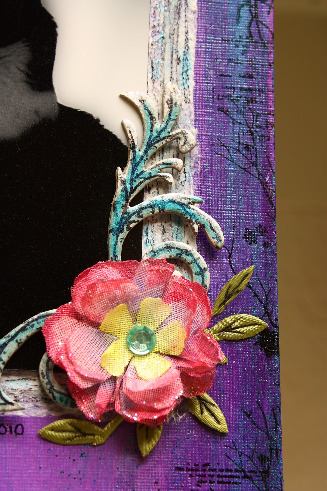
  14. Finally came the flowers.  I used lots of flower layers and painted each layer with glimmer mist.  White flowers got pink centers, pink flowers got darker pink tips, and blue flowers got teal tips.  The rosebud flowers each got color in their centers.
  15. Painted flower layers waiting to dry
  16. Now came assembly time and the finishing touches!
  17. Assembly in progress
  18. I wanted the tags to have a lot of dimension so elements stuck off the edge as well as were elevated.  I  stamped a bee directly on the tag and then glued the colored bee on top with it's wings up.  The bee below helps to anchor the image on the page. I also adhered the title with dimensional adhesive to help it stand out.
  19. Dimensional goodness
  20. I added some glue to the edges of the largest flower layer and sprinkled it with chunky clear glitter to help it shine and added a jewel to the accent flower on the ribbon. 
  21. I punched out a circle from the same patterned paper as the "remember this" and used it as a reinforcer for my hole for the tag.  I used a flower shaped eyelet for the hole, tied the second piece of ribbon and voila, done!

Final tags ready for their new home
Each tag had slight variations in color since they were each hand painted and they all came out a bit different in size.  I think this is a good representation of me and my style and hopefully the recipients will like them.  I can't wait to see what I get back in return!  I always find it so inspiring to see how other people create and how they express their own artistic vision.  This was such a fun project and I loved getting back to my stamping roots!  I think I'll visit here for a while.

Enjoy your journey!

Supplies Used:
  • Watercolor paper (Strathmore)
  • Quinacridone Magenta fluid acrylic paint (Golden)
  • Interference Blue heavy body acrylic paint (Golden)
  • Clear Glass Bear Gel (Golden)
  • Black permanent ink (StazOn)
  • Bee and flower stamps (Inkadinkadoo)
  • "remember this" and "Enjoy the journey" stamps (Hero Arts)
  • White seam binding (JoAnn's)
  • Blue floral patterned paper (Making Memories)
  • Flower eyelets (Making Memories)
  • Watercolor pencils (Karat Aquarell)
  • Rock Candy Stickles (Ranger)
  • China Blue Distress Stickles (Ranger)
  • Orange and yellow gems (Martha Stewart Crafts)
  • Pink and blue flowers (Making Memories)
  • White craftable flowers (Prima)
  • Yellow, white, green rosebud flowers (Recollections)
  • Riptide, Cherry Limeade, Tuscan Sun, and Blue Skies Glimmer Mist (Tattered Angels)
  • Glittering glue (Martha Stewart Crafts)
  • Glossy Accents (Ranger)
  • 450 Quick Dry glue (Helmar)
  • Diamond Dust glitter (FloraCraft)
  • Permanent markers (Bic)

Friday, September 3, 2010

The Old Man in the Tree: When Unexpected Things Happen

My hubby loves to paint with oils and is getting quite good!  He wanted to try his hand at acrylics (which I LOVE).  Michael's just happened to be having a 2 for 1 sale on Liquitex Heavy Body Acrylics so we popped on over and picked up the basic colors: red, blue, yellow, white, black, and a fun shade of orange (2 for 1 right?).  I've been using softer body and fluid acrylics on backgrounds and for painting embellishments but have never really "painted" anything with them.  He picked up a 12x12 pad for acrylic painting to practice on so I thought I'd play along while he tested things out.  So out we went into the garage (AKA the painting and "misting" studio).

First off, the texture of the acrylic paper was fantastic!!  It's smoother than watercolor paper and with a crosshatch texture.

I was channeling fall it seems so I mixed up some nice shades of orange and burgundy.  The heavy body acrylics are definitely different than the more fluid ones I'm used to so the brush strokes showed up quite a bit.  While I'm not averse to brush strokes, I wanted a more blended effect.  So I took an old sock, stuck it on my hand and dipped my fingers in some water.  I then rubbed across the page to smoosh the colors together and blend them.  Love love love this effect!  I could have actually thinned the paint beforehand but there is nothing like painting with your fingers.  I tend to do that a lot which is one of the reasons I stick to non toxic media. 

After the I finished the background I looked over at what my hubby was doing.  He is especially good at painting trees.  I love trees and thought "ooh, a nice scraggly tree would be perfect on the page".  I mixed up a nice brown and handed him the brush.  He started on the outline and then handed the brush back to me and said "you can do this!"  So I did!  Brush in hand, I went at it with no fear mixing and adding more layers of colors as I went.  I plan to add some 3d embellishments when I'm done so not all of the branches will show anyway.  What did I have to lose right?  I stepped back and took a look and felt pretty good about my first "painted" project.

Heavy body acrylics on paper

Then the magic happened.

I held it up proudly to my husband and said "what do you think?"  He took a look and responded, "cool!  Who's that guy in the tree?"  I took a closer look and realized that there was the shape of a face in the foot of the tree - totally unintentional of course!  How cool!  I love when things like that happen.  So of course I have to call this piece The Old Man in the Tree. 


Do you see the Old Man? Click the picture to view a larger image.
I think the Old Man needs some shade so I plan to add some 3d leaves to him and I'm thinking of writing a poem to include in the lower right corner.  Not sure yet.  I have a strong affinity for trees so I feel blessed that this special little "happy accident" occurred.  I will always cherish the Old Man in the tree for looking out for us.