Inky Goodness

Welcome! Thanks for stopping by and indulging my random thoughts on crafting and all things inky and messy. Nothing makes me happier than inky fingers and paint under my fingernails at the end of the day. A little glitter never hurts either. ;) Happy crafting!

Sunday, November 25, 2012

Art Journal Every Day - Day 7

I love when pages come together in a flash!  After a lovely fall picnic with my hubby and pup today I came home and whipped up this page for my 6x6 art journal every day project.

A few days ago I completed a long standing goal of organizing my spray inks and adding dots to the top of each bottle so I can see what color they are from above.  I used paper towels to spray on and kept them,  of course.  I wanted to use the vibrant dots of color in a project.  This project is the first of 2 that will use these paper towels.

 
I started with a piece of patterned paper from the class kit and did a light wash with gesso.  I then used the kit stencil with some permanent ink in yellow ochre.  I repeated one of the flag stamps to form borders along the top and bottom of the pages. Then it was time for the spray ink.
 

After everything was dry, I hand cut circles from the paper towels and layered them to create the flowers.  The stems are drawn with the Stabilo pencil.  Some white marker and gesso accents completed the page.


Friday, November 23, 2012

Art Journal Every Day - Day 6

My 6th art journal entry - fun with pastel pencils.  (See days previous days here and here.) Apparantly not only am I a paper hoarder but I'm an art supply hoarder as well.  I love playing with new media.  I picked up some pastel pencils and thought I'd give them a try.  I'm not too talented in the drawing department so I picked a very simple shape and went from there.


I liked the idea of using the patterened paper from the class kit as the background and doing my pastel drawing on top.  Both pastel pencils and pan pastels are somewhat transparent.

I drew my tulip first, then colored around it with pan pastels.  I used an eraser to erase some of the pigment for added texture.  I then filled in the flower with the pastel pencil, smudging as I went.  Super easy!

The quote came from a roll of paper towels.  It was on the paper towel I was using to protect my work surface.  I picked up my paper and there it was.  It just goes to show inspiration can come from anywhere!

A little distress crackle paint and distress ink around the edges and I was good to go.  Simple and easy.  Just like I like it!

Tuesday, November 20, 2012

Canvas Gift

For my mother in law's bday this year my husband and I decided to collaborate on a mixed media piece as her bday gift.  My husband has a special talent for painting trees so we decided that I would do the background and he would do the outline and shape of a tree.   My mother in law is a teacher, author, and book lover so the George R.R. Martin quote seemed perfect.

Loads and loads of rich color and texture.

I used glass bead gel and spray ink to create patterns and drippage on the background.

The glass beads are translucent when on top of the paint and opaque when painted over such as with the starburst stencil in the corner.  Leaves are hand cut and some are punched from old book paper.

Layers of stamping and stenciling for texture.

My favorite thing about gallery wrapped canvas - more room to play on the sides!

Monday, November 19, 2012

Art Journal Every Day - Days 3 - 5

Well, I started with the best intentions to art journal every day.  I've fallen a bit behind but here is what I came up with on my 3rd, 4th, and 5th days.  Contents are from the Cocoa Daisy art journal class featuring Julie Balzer.  See days 1 and 2 here.

Day 3

I started with a piece of patterned paper from the kit and added some transparent swipes of acrylics to create a plaid pattern on the background.
 
 
Following Julie's example in her video that comes with the kit, I tore apart a piece of the cardboard in the box to create a "stamp".  Using blue acrylic paint, I "inked" my cardboard "stamp" and "stamped" it on the page.  I love the uneven messy look.  I also used the Stabilo water soluable pencil to highlight the M, for Monday, on the background paper.  The zigzag pattern is from the patterns on the date stamp.
 
 
Keeping to my theme of limiting my supplies to kit contents, I used the label stamp from the kit to create the flower.  More Stabilo water soluble pencil and the Sharpie white marker and I was good to go!
 

Day 4

Day 4 just so happened to be election day.  I went with a red white and blue theme with stars in honor of the occasion.  I started with some spritzes of red ink.  I then applied a wash of gesso to the background paper from the kit to create some contrast from the pattern on the paper.

 
I wanted to use the points on the kit stencil to echo the star shapes so I applied a thin layer of molding paste over these sections of the stencil for extra dimension.  I hand cut the stars and used red and blue paint to tie it all together.
 
 
Day 5
 
For this page, I decided to play with my glass bead gel. I started with a thin but uneven coating of the bead gel over the entire page.  While still wet, I sprayed red and copper ink onto the page and let it drip down through and around the uneven layer of beads.  I painted the tree with thinned down acrylic paint and added a few highlights with the Sharpie pen.


I hand cut the leaves and quote from patterned paper in the kit.  I finished it off with some dry brush strokes of yellow paint mixed with gesso.  


 I've really been enjoying the process of sticking primarily to kit contents as well as working on a smaller sized background.  Now if I can just make more time each day to work on it!

Monday, November 5, 2012

Art Journal Every Day - Days 1 and 2

Julie Balzer and Cocoa Daisy teamed up to put together a kit and online workshop.  The theme - create an art journal and fill it with one page per day for a month.  It was intended to begin in December but I couldn't wait that long to get started!

I just started art journaling and have been working in a large format journal (11 x 16 ish).  The art journal in the Cocoa Daisy kit is a 6x6 mini album.  I've never been one to strictly adhere to the rules or to the contents of a kit so I went back and forth.  Should I start another journal with the 6x6 format or just use my current journal?  Should I do both?  Should I complete a whole page each day or just keep adding to my journal as I've been doing?  What is a scrappergirlie to do??!?!?

I eventually decided to have both journals running simultaneously.  I'll keep my large format journal and continue to work on it as I have been.  I'll also participate in the art journal evey day class using the 6x6 journal and complete one full 6x6 page per day for a month.  To keep things interesting, I added a self -imposed twist...

For the art journal every day project, I'll limit my use of supplies to the contents of the kit and only add in paints, ink, sprays, texturing media, standard tools (like punches and scissors) and product packaging from the kit.  Fun!  I find myself to be most creative when I have constraints and boundaries to work in. 30 days with the same set of supplies will indeed push me to be as creative as possible.


Class Kit Contents:
Balzer Desings Custom Stencil
Balzer Designs Custom Stamp Set
Crate Paper 6x6 Storyteller paper pad
Dear Lizzy 5th and Frolic roller date stamp
Freckled Fawn Gold Glitter Washi Tape
Pink Paislee Portfolio Photo Tabs
Jenni Bowlin Printed Tags Vintage
Stabilo Colored Marking Pencil Black
Maya Road Maya Mist Charcoal
American Crafts 6x6 Modern D-ring album
Dixie Kabinet Wax Deli Paper 5 sheets
Faber-Castell Metallic Gelatos
Sharpie Poster Paint Pen white
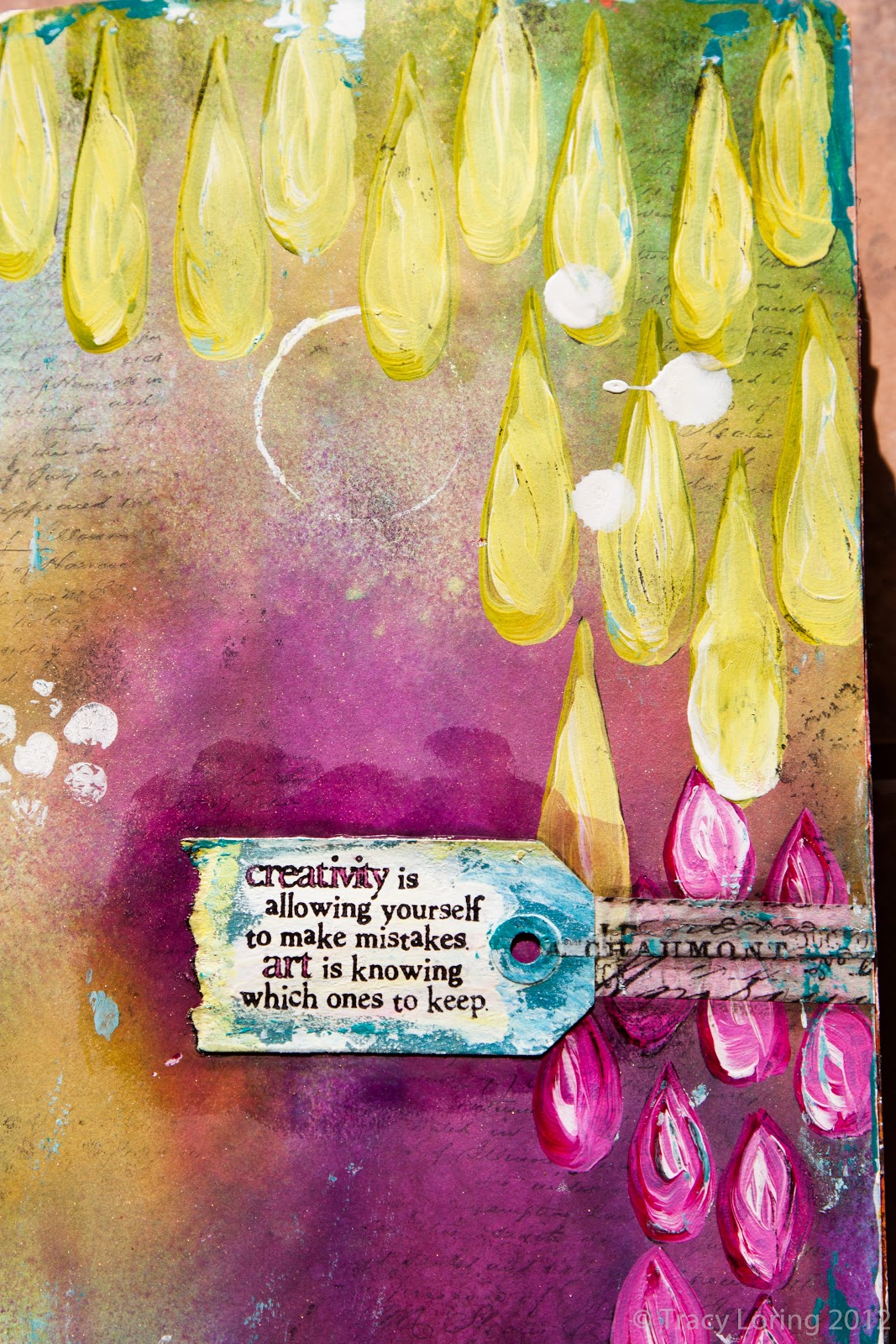
Day 1

So typical me, I break my own rule on the first day.  I used a text background stamp on this first page before I decided on the supply limitation twist.  Going forward, I'll keep to the stamps in the kit!

I painted and stamped the Cocoa Daisy stamp packaging and used it on the page.
 
Day 2

 Fun with paint and stenciling. 30 days with these fabulous supplies will be a snap!

Fun with Deli Paper

I've seen several recent blog posts from Julie Balzer mentioning the use of deli paper as a medium.  It sounded kinda cool so of course I had to try it out!  Deli paper is semi transparent paper used mainly in the food industry to wrap sandwiches and the like (hence the name deli paper).  It has a waxy side and a non waxy side.  I've been experimenting on the non waxy side and I love it!  It totally melts into the background when adhered yet isn't completely sheer.  It's fantastic!

Below is my first finished creation using two pieces of deli paper.  The fragment on the left is painted and the fragment on the right is not.


The page started with collaged patterned paper as the background. I added stencils and circles to add more texture prior to misting areas of the background with grey spray ink.

Sheer and subtle over the painted background page.

A painted focal point that allows the background to show through.

Reusing Ink from Stenciling

I use stencils in just about every journaling page.  They are versatile, come in many many designs, and are a great way to kick start any project.  The harlequin shape is one of my favorites and I have a few stencils with that shape.  I used a 6x6 harlequin stencil in various places on the background of this page.

Butterfly, flourish, and word stamps from Tattered Angels.


Lots of drippy india ink and paint.
 
After using the stencil on the background of the In Flight page, I took the ink laden stencil and sandwiched it between a couple of pages further on in my journal.  I didn't want to waste the ink and the reverse image is kinda cool.  It served as the background for my next journaling page.


I took my color palette from the leftover stencil ink.  I dug into one of my ancient paper stashes (yes, I too am a craft supply hoarder) and found some cool paper.  I cut up the paper for a border, trees, and tree trunks.

You can really see the reversed harlequin stencil behind the trees.

I really love how this page turned out.  I think it's one of my favorites yet.

When in Doubt, Keep Painting

 My original idea for this journal page was to paint over printed pattern paper.  I had planned for the pattern on the paper to give a nice background texture to the piece.  However, once I got going I didn't like the result.  Eventually I ended up painting over the whole background and adding in more and more flowers to fill the page.

Flower outlines from a Donna Downey stencil.
If you look closely you can see the bubbling of the paper on the background from where it got too wet from all of the paint layering and removing as I worked and re worked it.  But texture is texture and I'm okay with that!


An Ode to Tim Burton

This was one of those pages that happened lickety split.  Halloween was coming and I had an idea to paint a swirly hill a'la Tim Burton and A Nightmare Before Christmas (one of my fav movies of all time).

I used ink mists for the sky and acrylics for the "moon bursts", moon, trees, and hill.  Super fun.  Super fast.


Julie Balzer mini burst stencil created the silver "moonbursts" in the sky.

Glimmer Mist and Stencil Goodness

Nothing makes me happier than big pools of yummy colors on a page.  I started this journal page with just two things in mind:
1) I wanted to use my new Julie Balzer stencil.
2) I wanted to dig out my Glimmer Mists.

I stamped the background with some text for texture then layered on several colors of Glimmer Mist.  Once that dried I traced the rain drops from the stencils and hand painted them in with acrylics.  I'm really enjoying the act of painting.  It's one of the great things I love about stencile.  You can trace them and hand paint the insides. 


This Tim Holtz stamp is one of my favorites.  I used Decopage to glue down both the tag and help adhere the tissue tape.  Although the Decopage is matte, I didn't realize it would change the sheen of the background to be so noticeable.  I like how it turned out anyway.

White rings from a toilet paper roll, white flower looking dots from bubble wrap, and white spots from dropped india ink.

A New Crackle Medium

I'm addicted to texture.  I can't get away from the tactile feel and the look of lumpy bumpy things on a surface.  I think this is part of the reason why I haven't gotten too into digital media.

While shopping around online I came across a crackling medium I hadn't tried before.  I've used craft mediums from Plaid and such as well as crackling paste from Golden.  This medium from Matisse was described as yielding a thinner texture and worked between layers of paint in a traditional crackle medium way.  I thought "what the heck?" and picked it up.

I tried it out on the background of this page.  I started with a base layer of paynes grey, let it dry, then applied the crackle medium.  Once it had dried for the specified length of time I layered mixes of acrylic colors over the top hoping that the dark blue color would come through.


Flower shapes are from a Donna Downey stencil
I only added the crackle medium in certain places thinking it would give a nice texture if it were uneven and not uniform across the background.  The result was very subtle. Next time I will try a thicker layer of the medium for a more pronounced effect.

Very subtle crackling
No words or theme for this page.  I like its simplicily.  Besides, it was all about playing with my new toy. 

Forward Motion

When I turn to my art journal I usually have an idea (it could be a word or a theme), color palette, or medium I'd like to use as inspiration.  In this case, I had the idea of having textured hearts in the background using molding paste with a larger heart as a focal point using washi tape.  I just picked up a fabulous orange washi tape that served as the inspiration for my palette.

The resulting page isn't one of my favorites.  I worked, re worked, and re worked some more to get it to a point that I liked it enough to say "done".  I may go back and tweak it more one day or I may not. 


These words seemed to work not only for the imperfect execution of my vision for this page, but for the nature of love itself as well.

It just didn't come together for me the way I'd envisioned. Even so, it was a great lesson in "forward motion".  Just keep going whenever you get stuck.  It doesn't have to be perfect, and you don't even have to like it.  Just play, learn, and keep moving.

Fall Color Inspiration

My husband and I celebrated our 3 year wedding anniversary this October.  A beautiful bouquet of fall flowers awaited me when I got home from work.


Beautiful fall color
Each day I took in the beautiful colors in the arrangement and was inspired to use a similar palette.  The following art journal page was the result.

The flower shapes are from a Donna Downey stencil. 

Background stamping peeking through the painted flowers in the foreground.

Autumn - my favorite season of the year.

Taking the Plunge - Art Journaling

I've been a big fan of both Donna Downey and Julie Balzer for quite some time.  Each has been a big proponent of art journaling.  Theoretically, I love the concept but never got around to starting an art journal.  Instead I worked on projects as I had the time and inspiration.

While taking one of Donna's online pan pastel classes, I purchased and worked in an art journal to complete the exercises and experiments.

Now I get it.

An art journal is so freeing!  Doing something creative on a regular basis makes you even more creative.  I experienced that first hand when I used to teach rubber stamp art classes many moons ago.  The great thing about an art journal is that you don't have to share it with anyone if you don't want to.  It's all for you and your experimentation.  Best of all, if you don't like what you did, turn the page and start again!

I've been art journaling regularly for about a month now and I haven't been this creative or inspired in a very long time.

I picked up one of Dyan Reaveley's creative journals.  I liked the larger size.  So far it's been great.  I usually apply masking tape to the center seam and gesso the pages before beginning (tips I picked up from both Donna Downey and Julie Balzer).  Sometimes I finish a page in one sitting and sometimes I work on it a little at a time.  It all depends on how much time I have that day.

Here is my first page.  If you've been thinking about art journaling and are still on the fence, I highly recommend taking the plunge.  No one has to see what you create and I guarantee you'll get more and more creative the more you do.  But best of all, it's just plain fun!

Page 1 - Change

I'd been thinking a lot about change and how people handle it differently.  It seemed like a great theme for my first page in my journal.

This page started with layers of neocolor water soluable crayons in green, blue, and yellow.

 
I used both the 12x12 and 6x6 sizes of Julie Balzer's butterfly stencils to create the butterflies on watercolor paper. I began with molding paste.  Once dry, I used gouache and india ink markers to paint them before cutting them out and adhering hem to the background.
 
The larger butterfly on the background was traced from the 12x12 stencil with a silver pen.
More stencils, stamping, and drippage created background interest.  The word change was created with bright pink letter stickers.  I used india ink markers to change (no pun intended) their color to match the layout.


Layers and Layers and Mica of Course

I've been under the weather lately and am just now getting to publish these posts that have been sitting in draft mode for a while.  (You know how that can be.)

Another fun tool I recently came across is Golden's mica gel.  It's basically clear gel medium with mica flakes in it.  You can get gold, pearl, and black in large and small flakes. I picked up the pearl and gold in the small flake.  Here's my first project using it.  I've been very inspired by fall color lately so the gold mica seemed like a good start.

I started with an old 5x7 canvas from another project and gesso'd over it.  Lot's of layers of acrylics and stencils and this is what I came up with.

Fall color loveliness. (If this photo appears fuzzy, try clicking on it.  There seems to be something odd going on with the image import.)

The flowers are painted burlap.  The leaves are hand cut from paper. You can see the gold mica on the left edge.

Stencils and layers and texture hooray!

Pan Pastels

I love love love playing with new media!  I'd heard so much talk about pan pastels I decided to give them a try.  My hubby and I took a weekend a few months ago and did Donna Downey's online pan pastel classes.  Super fun and very informative!

This is my first project using them.  Of course I had to throw in paint, ink, molding paste and other fun goodies as well.  All in all, a super forgiving media that's lots of fun to play with. 

Lots of texture and paint drippy goodness.
Before starting, I loaded up the blank page with lots of thick gesso.  The result is lots of lines of texture that were a nice ground for the pan pastels. You can see these lines in the yellow part of the background.
I used molding paste through a stencil to get these raised impressions. Pan pastels work great over the tops of the molding paste sections.
A good starting place. Lots of spray ink, pan pastels, and gesso.


Focal point details.  The butterflies are made of wood.